
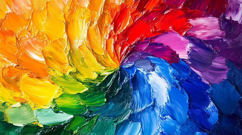
Colour has the remarkable power to influence mood, shift perceptions, and even alter behaviour. In the world of art, this influence becomes even more profound, as artists use colour not only to create aesthetic beauty but also to communicate emotions and ideas in ways that transcend language. From ancient cave paintings to contemporary exhibitions, colour has always been a vital tool for expression, symbolism, and storytelling.
Modern audiences are increasingly aware of how colour impacts them, whether they’re conscious of it or not. This awareness has also led to a deeper appreciation of artists who explore and experiment with colour psychology in their practice. A wonderful example can be seen in Marie Bernard’s art, where carefully chosen hues evoke responses that feel at once deeply personal and universally relatable.
In this article, we’ll explore the fascinating role colour psychology plays in artwork—how different shades affect our emotions, why artists use certain palettes, and what it all means for the viewer’s experience.
Understanding Colour Psychology
Colour psychology studies how colours influence human emotions and behaviour. While interpretations can vary between cultures and individuals, there are widely recognised associations that tend to remain consistent. For example, warm tones such as red, orange, and yellow are often associated with energy, passion, and vitality, while cool tones like blue and green are linked to calmness, serenity, and introspection.
When applied to art, these psychological connections enhance the work’s impact. A painting dominated by deep blues may bring feelings of tranquillity or melancholy, while one saturated with bright yellows can spark joy and optimism. Artists deliberately manipulate these associations to shape the viewer’s emotional response.
Historical Use of Colour in Art
The psychological power of colour is not a new discovery. Artists throughout history have intuitively understood its influence.
– Ancient civilisations: Egyptians used specific colours in tomb paintings and hieroglyphics to symbolise concepts such as fertility, rebirth, and protection.
– Medieval art: Colours carried strong religious meanings—blue was associated with the Virgin Mary, symbolising purity, while gold reflected divinity and eternal light.
– Renaissance and Baroque periods: Masters like Caravaggio and Rembrandt used dramatic contrasts of light and shadow (chiaroscuro) with bold colour to intensify emotion.
– Modern movements: From the vivid hues of Fauvism to the stark minimalism of Abstract Expressionism, colour has often been at the heart of artistic innovation.
These historical choices demonstrate that colour has long been more than decorative; it has always served as a psychological and symbolic language.
How Artists Use Colour Psychology
Artists today continue to rely on colour psychology to craft powerful experiences for their audience. Some of the ways this is achieved include:
- Setting the mood: A cool-toned landscape can invite peaceful reflection, while a fiery abstract piece may provoke energy or unease. The palette often dictates the initial mood before the subject matter is even fully processed.
- Highlighting meaning: Colour can act as a symbolic shorthand. For example, red often conveys passion or danger, while green might symbolise renewal or nature.
- Guiding the eye: Bright or contrasting colours draw attention to focal points within a composition, shaping the way a viewer visually moves through the artwork.
- Creating harmony or tension: Some artists use complementary colours to create pleasing balance, while others intentionally use clashing hues to evoke discomfort or challenge the viewer.
- Encouraging introspection: Subtle shifts in tone and saturation can influence how long and how deeply a person engages with a piece. Muted colours may invite quiet contemplation, whereas bold, saturated colours might demand immediate impact.
Common Colour Associations in Artwork
While interpretations can differ, there are some general psychological effects that tend to be consistent:
– Red: Energy, power, passion, love, danger.
– Orange: Warmth, enthusiasm, creativity.
– Yellow: Happiness, optimism, intellect—but also caution.
– Green: Growth, balance, nature, renewal.
– Blue: Calmness, trust, spirituality, melancholy.
– Purple: Luxury, wisdom, spirituality, mystery.
– Black: Power, sophistication, grief, the unknown.
– White: Purity, simplicity, peace, emptiness.
Of course, artists often subvert these traditional associations to surprise and challenge their audiences, demonstrating that colour psychology is both a guide and a tool for creative freedom.
The Viewer’s Experience
When standing before a painting, viewers rarely analyse colours consciously. Instead, they feel. The immediate response is often emotional rather than intellectual, and colour plays a significant role in this reaction.
For example, entering a gallery filled with large-scale works dominated by vibrant reds and oranges can feel energising, even overwhelming. In contrast, a room showcasing soft blues and muted greys may leave viewers feeling calm, thoughtful, or even somber.
The psychological effects of colour don’t stop at the gallery door. Artworks brought into the home or workplace can shape daily mood and atmosphere, creating spaces that feel either energising or soothing depending on the palette. This is why interior designers often collaborate with artists to select pieces that harmonise with the intended atmosphere of a room.
Cross-Cultural Interpretations
It’s also important to remember that colour psychology is not universal. Cultural differences can dramatically alter how colours are perceived.
– In Western traditions, white symbolises purity and weddings, while in many Eastern cultures it is associated with mourning.
– Red, often linked with danger in Western cultures, symbolises prosperity and luck in China.
– Black, which can suggest sophistication and luxury in Western design, may carry connotations of mourning and negativity elsewhere.
Artists often draw upon their own cultural background to inform their palette, and this can enrich the viewing experience by adding layers of meaning that differ depending on the audience.
How Collectors Can Apply Colour Psychology
For art collectors and enthusiasts, understanding colour psychology can enrich the process of choosing works for personal or professional spaces. Consider the following:
– Desired mood: Do you want a room to feel calming or energising? Select artworks with palettes that reinforce this.
– Personal resonance: Which colours evoke positive emotions for you personally? This ensures a deeper, lasting connection with the piece.
– Balance: Combine artworks with different colour schemes to create variety without overwhelming the space.
– Cultural meaning: Be mindful of colour symbolism if your collection will be shared with audiences from diverse backgrounds.
By thinking about colour psychology, collectors can curate spaces that not only look beautiful but also enhance wellbeing.
Colour is far more than a visual element in artwork—it is a psychological force that shapes how we interpret and respond to what we see
From historical symbolism to contemporary innovation, colour has always been a language through which artists communicate emotion, meaning, and energy. Whether it’s the warmth of fiery reds, the serenity of cool blues, or the quiet balance of muted tones, the psychology of colour continues to play a central role in the power of art. For artists and viewers alike, this interplay between colour and emotion ensures that art remains a deeply personal yet universally resonant experience.
